Color of Light: How to Evoke Emotion and Make Amazing Photos
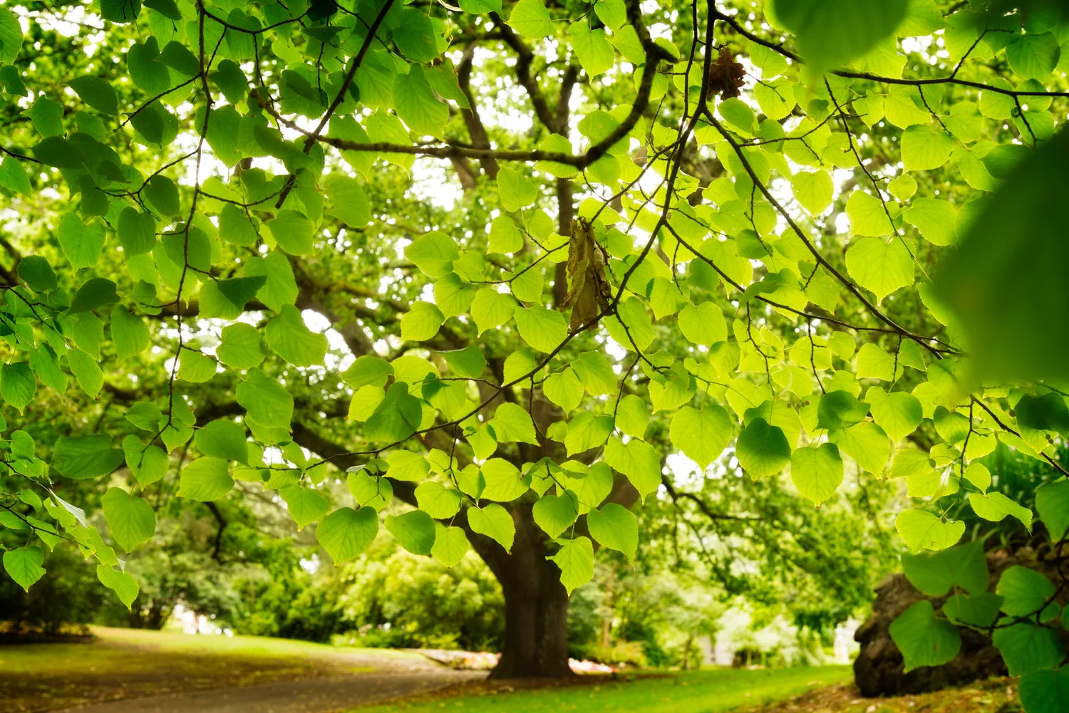
Aerial view showing blue skylight reflecting off the ice in Greenland.
Light is the most fundamental aspect of photography. Here's how I've learned to evoke emotion by controlling the color of light to make amazing photos.
The color of light can vary dramatically depending upon the light source, the time of day and the weather under which you make photos. Light can vary in color from violet through green to red. White light is a combination, in equal amounts, of all colors in the color spectrum.
Let’s explore the characteristics and qualities of light and how you can manage light to dramatically improve your own photography.
Application of these theories will result in amazing photos that are full of emotion and visual appeal.
Table of Contents:
The Color Of Light Is Rarely White
One of my photography mantras is that Light is Rarely White. It might sound strange, but I consider it essential knowledge for all serious photographers.
The above image was made, through an airplane window, while flying over Greenland. I remember wanting to convey the cold, stark and haunting beauty of the landscape.
That required selecting a white balance that explored the particularly cold color temperature of the light and how it transformed the color of the landscape below.
The color of the light was aqua/blue, which I’ve emphasized during post processing.
I believe the final result displays color and mood that, while intense, reflects the reality of the scene and how I felt while looking down at this massive world of ice.
You'll notice that it's basically a monochromatic (i.e., one color) image. In this case that's because I’m photographing an otherwise neutral color scene under intense bluish light.
Skylight is a huge and diffuse light source and the highly reflective ice is simply taking on the color of the sky that’s illuminating it.
You’ll notice how the areas of ice that appear more neutral in color are reflecting some of the gentle light from the sun.
However, the shaded areas of the image are being lit by the sky and the deeper the shade the more they take on the color of the sky.
You might be interested to know that the image was made on Daylight white balance, referred to as Direct Sunlight or Sunny on some cameras.
I chose the Daylight white balance because that’s the one that accurately depicts the color of light under which you’re photographing.
Ironically that’s the reason why Daylight is my default white balance setting for night photography.
Greenland is an incredible place for landscape photography and I’m very much looking forward to returning to explore more of this vast and beautiful country.
Incandescent light and shadow at Berliner Dom in Berlin, Germany.
What Is Light?
Light consists of photons which are particles of energy that transmit light. But, in addition to particles, light is also made up of colored wavelengths.
Light is the most fundamental aspect of photography and my study of light and how to manage it has been central to my own ability to creative beautiful, life affirming photos.
I encourage you to pay attention to light, in particular to observe and, where possible, manipulate the following qualities of light.
Intensity of the light
Direction of the light
Quality of the light
Color of the light
Take a look at this photo of a framed portrait and the shadow of a light bulb on a wall at the magnificent Berliner Dom cathedral in Berlin, Germany.
If you’ve been fortunate to have visited Berliner Dom for yourself you may struggle to recognize this space. That’s because it’s in a subterranean room underneath the church.
Intensity Of The Light
We can describe the intensity or brightness of the light in this scene as medium.
That’s why there’s not an enormous difference in relative brightness between the brightest and darkest areas across most of the photo.
This relatively modest dynamic range is the reason why the shadow of the light bulb has not recorded particularly dark in this picture.
Direction Of The Light
The direction of the light determines where shadows are cast in a scene.
In this photo from Berliner Dom light is falling directly onto the scene from behind the camera.
Quality Of The Light
Quality of light is generally described as either hard or soft. Generally you’ll want to be photographing under soft lighting because it produces flattering, somewhat pictorial results.
The quality of light is determined by the size of the light source in relation to the subject.
A small light source produces a hard quality of light and sharp edged shadows. Conversely, a large light source produces a soft light and shadows with edges that are less clearly defined.
As you can see the edges around the shadow of the light bulb cast on the wall are quite soft.
Color Of The Light
As you can see the color of the light is warm. That’s because the scene was illuminated by an incandescent or tungsten light bulb.
The irony is that the intense color of the light simply wouldn’t have been evident to most folks who visit this space.
As the only light source in the room is incandescent, it’s likely that your brain would have neutralized the intense yellow/orange color of the light reflecting off the wall back into your eyes.
Put simply, as you believe the wall was painted with white pain your brain filters the color of the light so that the wall appears a relatively neutral white.
Cameras, set my default to Auto white balance, have been designed to work in much the same way.
This is an important understanding because, while our eyes see the world around us, our brain interprets and determines what it is we’ve actually seen.
It’s just one way in which our perception determines our reality.
Understanding the Electromagnetic Spectrum
The human eye can only see a tiny portion of what's referred to as the Electromagnetic Spectrum which includes the following:
Gamma Rays
X-Rays
Ultraviolet Rays
Visible Light (i.e., The Visible Spectrum)
Infrared
Microwaves
Radio Waves
Color And The Visible Spectrum
The colors we humans perceive are contained within what's called the Visible Spectrum.
Measured between 400 and 700 nanometers the visible spectrum contains a range of colors that film and digital cameras are designed to record.
Violet
Indigo
Blue
Green
Yellow
Orange
Red
Is White A Color?
White can be considered a color as it reflects all wavelengths of light from the Visible Spectrum, in equal amounts.
Strictly speaking black, by which I mean jet black, is not a color because it absorbs all of the light that falls onto it.
Having said that black is also referred to as an achromatic color. That definition means that, just like white and gray, black is a color without hue. In other words it’s neutral.
Given that the word hue refers to the actual color of the color (e.g., baby blue rather than navy blue) you can see why that definition of achromatic color isn’t necessarily all that helpful.
It's nice to be accurate, particularly if you're a photography teacher like me. However, sometimes what's right is dependent upon the context in which a statement is made.
Perhaps it's best to be open minded about whether black is a color or not. Such discussions can become academic and, frankly, who wants to be lost in semantics.
Being absolutely committed to a viewpoint, one way or another, won't necessarily make you a better photographer.
Incandescent lit alley at night in the city of Bruges, Belgium.
What Is The True Color Of Light?
The color of the light that we photograph under varies based upon the time of day, weather conditions and depending on whether the light is natural or artificial.
The White Balance function on your camera provides a range of options by which you can neutralize the color of the light so as to enable you to record the world around you closer to the way you perceive it.
This will ensure that a red sweater photographs red rather than, for example, orange.
A few important points worth noting are as follows:
We all see colors and the color of light differently.
In most circumstances our brain tries to neutralize the color of the light so that we perceive colors within the world around us as we would expect them to appear.
We can see color in light, for example when watching a rock band or stage play when, the color of light changes from moment to moment or when more than one color of light is present simultaneously.
Why Sunsets Are Red In Color
Light reaching us from the sun at sunrise and sunset has to pass through more air than at other times of the day when it's higher in the sky.
The more atmosphere the more molecules there are to scatter the violet and blue wavelengths.
As a consequence the warmer yellow, orange and red wavelengths become more visible to the human eye.
Psychologists tell us that our brain is less likely to try to neutralize the color of the light at sunrise and sunset because of our collected memory of what a sunrise or sunset should look like.
It’s said that, in the case of sunrise and sunset, the history of landscape painting has influenced our collective memory.
Put simply, we know that light at sunrise and sunset is warm in color so, being more accepting of that concept, our brain is less likely to neutralize the lovely, warm color of light present at that time of day.
Take a look at this photo, made on a summer’s evening, looking down a narrow alleyway in the beautiful city of Bruges in Belgium.
The scene was bathed in incandescent (i.e., tungsten) light which, as you can see, illuminated the scene with a very warm, yellow/orange light.
Traditionally incandescent light was emitted by those screw in and bayonet light bulbs that were common in kitchens and certain types of desk lamps.
Those globes have been replaced these days by newer fluorescent light sources.
This new light can vary in color from warm, incandescent like color to much cooler color hues depending upon the glove in question.
This can make it harder to manually select the right color balance up front.
But testing out a few white balance presets, including Auto White Balance (AWB), should get you close to an optimum result.
And that’s the case whether you’re after a neutral white balance or, as is the case of my picture of a colorfully lit alleyway in Bruges, a more visually interesting result.
The small, round halogen (i.e., down lights) globes found in many living rooms have a similar color temperature to traditional incandescent globes.
If it’s night time and you want to neutralize the color emitted from those lights you could try the Incandescent/Tungsten white balance setting or, alternatively, try Auto White Balance (i.e., AWB).
But, every now and again, your photo will benefit from the romance that warm, yellow/orange incandescent light will bring to the image.
In that case try a Daylight white balance to accurately record the color of light and it’s effect on what you’re photographing.

About To Travel?
What Color Light Is Best For Pictures?
As to the best color of light for making photos I’m afraid the answer it depends seems most appropriate.
Neutral colored light is ideal where absolutely accurate color rendition is required.
Just think about famous paintings that are documented for posterity and for insurance purposes.
Likewise, there would be certain types of fashion photography where critically accurate color reproduction of the fabrics depicted would be required.
A studio environment where the color, direction and quality of the lighting is controlled is often considered ideal for these kinds of photography assignments requiring such a high degree of color fidelity.
But for most of us our photography involves both documenting the world around us, the places we visit and the people with whom we interact.
In most cases we balance a need for accurate documentation with a desire to produce life-affirming, beautiful photos.
That’s why most of us would be happy to render the color of an otherwise disappointing sunset in a more positive way than, perhaps, it actually appeared on that particular day.
Selecting a warm color balance is one way to achieve this result.
Freeing the mind from the notion of reality is important for the artist.
Great photos are often more concerned with the way you felt about what you photographed than how it actually looked at the time the image was recorded in camera.
Imagine a scene that’s illuminated by bluish colored light. That’s a light source well suited to exploring a variety of notions such as peace, serenity and melancholy.
Being able to make a great color photo involves arranging a visually interesting composition and being able to adapt to the vagaries of light under which you’re photographing.
Changing In Camera White Balance
You can apply a white balance correction in a number of ways prior to making the photo in camera.
The various white balance settings can be accessed from within your camera's menu or by using a dedicated button labeled WB or AWB.
Once activated you can scroll through a variety of icons and/or a list of options representing the different white balance presets available to you.
My preference is to manually adjust the white balance by choosing one of the options from the following table.
Be aware that the names of these white balance presets will vary across camera brands and, occasionally, from model to mode.


White Balance Naming Conventions
It may also be that your camera uses symbols to illustrate a particular white balance.
So a graphic symbol representing the sun would be the same as Sunny on a Canon or what’s referred to as Daylight or Direct Sunlight on a Nikon.
Likewise a graphic illustrating a building in shade would be referred to as the Shade setting in camera menus that use symbols rather than words to define white balance presets.
It’s really not all that hard once you’ve got your head around what each of these terms or symbols mean and, of course, accept the fact that light is rarely white.
So when you’re paid a compliment on your photography, followed by a comment along the lines of is that what it really looked like, here’s some possible replies:
Yes, absolutely.
No, I changed the white balance to produce a more pleasing result.
No, I messed around with it in Photoshop and now it’s ended up looking nothing like it did.
How would I know, I’m only the photographer.
Quiet night on the canal lit by incandescent light in Bruges, Belgium.
White Balance With RAW Files
The fact is that, for folks photographing in RAW mode, it doesn’t really matter what white balance you have your camera set to.
This is why a lot of photographers probably set their camera to Auto White Balance (AWB).
They probably just don’t want to think about such things at the time the photo is made, in camera.
What’s more they know they can easily reset the white balance in a RAW Converter such as Lightroom while processing the RAW file on the desktop.
Personally I want to ensure I’m happy with the white balance prior to moving onto the next image. That’s why, despite the fact that I photograph in RAW mode, I like to set the white balance in camera before the image is exposed.
Solitary penguin in the harsh, beautiful landscape above Paradise Harbor, Antarctica.
White Balance and JPEG
However, if you’re photographing with your camera set to JPEG, it’s critical that you get the white balance right in camera.
Although you can adjust white balance in a RAW Converter like Lightroom, your options can be dramatically reduced when the file you’re working on is a JPEG.
White Balance on a RAW file is really just a tag that’s applied to the file. You can change the tag (e.g., Cloudy to Incandescent) in your RAW Converter at any stage without any loss of image quality.
The same is not true for a camera-generated JPEG file. In this case the white balance is literally baked into the file.
While you can add strawberry’s on top of a chocolate cake, it’s still a chocolate cake. Is it not?
Likewise, while you can tweak the image in an application like Lightroom, you’ll never completely correct a JPEG image with really poor white balance.
I know, I’ve tried.
If you’d like more information on a RAW versus JPEG workflow and what’s most appropriate to your own needs you should take a look at this post titled RAW Versus JPEG - What’s Best?
Conclusion: Embracing Light and Color
I hope you’ve enjoyed this article on the color of light in photography.
Have no doubt understanding the characteristics and qualities of light can make a huge difference in your ability to produce beautiful and highly communicative color photos.
I recommend you seek out and embrace interesting light whenever you’re able to.
In some cases light will be so important in your pictures it will become the actual subject matter of the photo you’re making.
A sunset photo is a great example of that concept, but the same is also true for night photos comprising large areas of artificial light.
And don’t miss the opportunity to photograph under the cold blue light of dawn and twilight, or under rain bearing skies like I got to do in the fabulous Faroe Islands.
Once you get past the limitations of the human eye and how our brains perceive the color of light you’ll be able to better embrace light and color in your own photography, particularly after you’ve mastered White Balance and Color Saturation.
Photography is like learning the piano. It’s a lifelong endeavor. But that doesn’t mean it’s not fun and a truly incredible way by which to embrace life’s journey.