The Color of Light in Photography
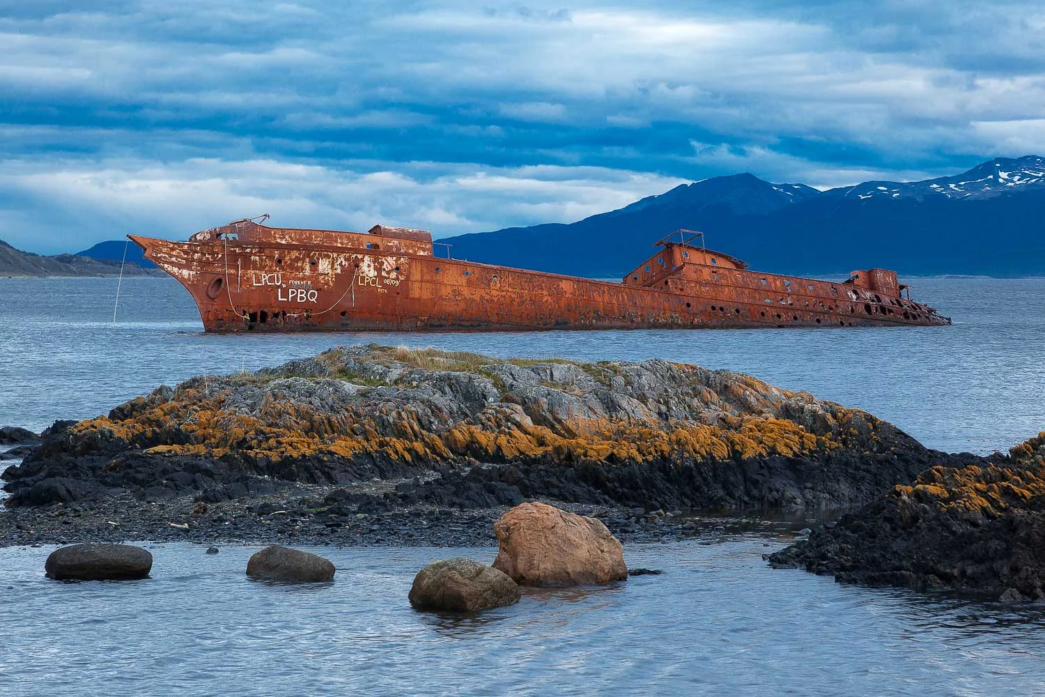
A ship, now no more than a rusting hulk, lies in a bay near the city of Ushuaia in the far south of Argentina. The orange color of the ship is illuminated by the gentle sunlight and is a striking contrast against the predominantly bluish light resulting from gathering storm clouds.
It’s a myth that rain-bearing clouds are grey. They are actually blue in color. This photo, made off the coast of Ushuaia at the very bottom of Argentina, proves this point.
Now let’s examine the facts.
“Rainy days are not grey, they’re blue.”
The Color of Light and the Color of Subject
The color of the foreground rocks and grass, as well as that of the rusting ship in the mid ground, look pretty much as you would expect them to.
That’s because they are lit with gentle sunlight, sometime between an hour after sunrise and an hour before sunset.
It’s during that relatively large window of the day that we can expect sunlight to be, more or less, neutral in color.
However, the distant mountains are shaded. They are not lit by the sun, but by the sky above.
The distant mountains are blue because they are reflecting light from the clouds above, many of which are blue in color.

About To Travel?
Why The Difference in the Color of the Clouds?
The white clouds do not contain rain, the blue ones do.
Let me say that again, albeit in a different way.
Rain bearing clouds are not grey. They are bluish in color.
Wow! But why don’t most folks know this?
It’s because our eyes see the bluish color of those rain-bearing clouds, but our brain actually neutralizes (i.e., white balances) the color of the light coming through those clouds.
Ultimately, our brain doesn’t believe what we see (e.g., bluish clouds) so it does it’s best to render the world the way it thinks it’s supposed to look.
Our notion of reality is somewhat skewed and quite often has more to do with our state of mind and level of physical comfort at that particular time.
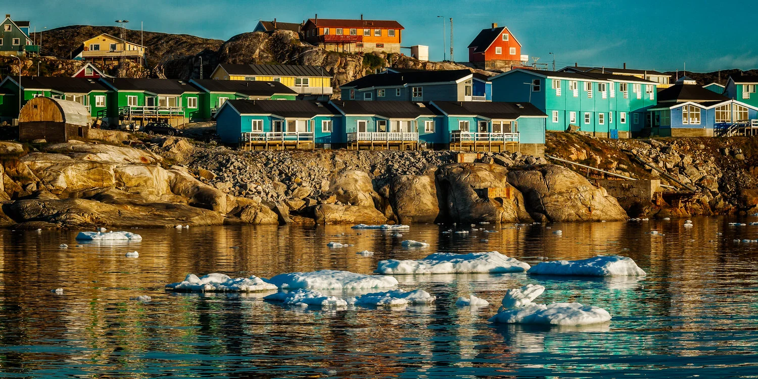
Early morning light at De la Estancia on the outskirts of Ushuaia, Argentina.
You Need To See The Color Of The Light
Have you ever been in a conversation when someone comments on the beauty of one of your photos and then asks, is that really what it was like?
That’s a difficult conversation once you understand the information I’m sharing with you. Given that, it’s probably best just to say yes.
However, the fact is that colors in our photos are effected by the color of the light which in turn is effected by the weather we find ourselves photographing under.
Understanding how to set the White Balance on your camera allows you to correct the color of the light so that things photograph the way you would expect them to.
Alternatively, you can allow the color of the light to affect the mood of your image.
Depending upon the circumstances and the result I’m wanting to achieve I choose one of those two quite different approaches.
White Balance is a very powerful tool for the creative photographer. But don’t go looking to your camera’s instruction book for answers.
Camera manufacturers do a very poor job, in my opinion, of explaining how best to set white balance on your camera.


How to Look at Photos
The subject matter in the photo at the top of this post is interesting. It allowed me to explore the theme of environmental damage in an otherwise remote and relatively pristine environment.
I think it’s a beautiful image, but it’s a somewhat melancholy beauty.
However, this photo is also very much a study of color. It explores the color of certain subjects, the relationship of those colors with each other and variations in the color of the light across the landscape.
And who said you can’t approach topics of concern in a creative and picturesque way?
My view is if you want to engage your audience, even with potentially difficult themes or concepts, you need to do so through beauty.
I’m suddenly remembering some of those famous photos from the Vietnam War (what’s called the American War in Vietnam). They were tragic, they were challenging and they were incredibly beautiful.
The duality between beauty and horror is the reason why people looked at those photos as intently as they did.
It’s also why those photos, after all these years, are remembered so vividly and still elicit such emotional responses.
A stand of trees in a forested area on the shores of the sea in Tierra del Fuego National Park, Argentina.
Color Elicits an Emotive Response
I think the image at the top of this post features an interesting interplay between the positive feelings we would usually associate with sunlight and the color orange, compared to the more melancholy feelings sometimes associated with the color blue.
Those two colors, orange and blue, are by far the most potent elements of composition within this photo.
There’s different ways by which we can perceive and photograph our world. Likewise, there are many ways by which we can enjoy photographs.
The more we look the more we are likely to find. And that’s a great reward for someone who looks that much more closely than the average Joseph or Josephine.
For example, I’ve added very subtle olive and yellow/orange hues (i.e., colors) to the above black and white image of a stand of trees by the sea in Tierra del Fuego National Park.
You may not be able to see those colors, because they’re so subtle. But their function is to gently shift the mood of the image and, with it, your emotional response to the photo.
Such things may be lost on the average computer screen. But in a gallery environment, or as a display print in your home, these gentle changes are very important to the success of the image.